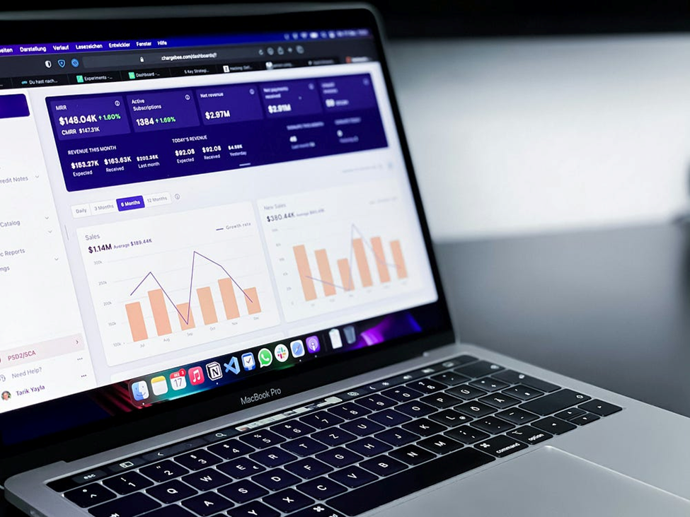
Mastering Dashboards: The Three Essential Ds You Need to Know

Photo by path digital on Unsplash
“Without data, you’re just another person with an opinion.” - W. Edwards Deming.
In today’s digital world, data isn’t just numbers on a spreadsheet - it’s the driving force behind everything from business decisions to public policy. The global big data and analytics market was valued at a staggering $271.83 billion in 2022 and is expected to more than double by 2029 (Fortune Business Insights). In administrative domain, New York City used predictive analytics to identify fire-prone buildings, leading to a 20% increase in accuracy in predicting major fires (apolitical). With the world generating a mind-blowing 120 zettabytes of data in 2023, one thing is clear: those who harness the power of data are shaping the future.
Every day, organizations generate vast amounts of data — but raw numbers alone don’t drive decisions. Data visualization makes complex information clear, revealing trends and patterns at a glance. From tracking markets to predicting disasters, compelling visuals turn data into action. As data grows, those who master its representation will shape the future.
There are two types of visualizations that can be used to represent your data:
1. Static Visualization
2. Dynamic Visualization
While static visualizations are useful for presenting information from cross-sectional data that remains unchanged, they fall short when dealing with real-time updates or when data doesn’t have many features. The real-time data creates demand for dynamic visualization and that’s where the dashboards are one of the potential answers to visualize updated information.
Dashboards may seem appealing to anyone in data-driven roles, but they aren’t always the best solution. To help determine their effectiveness for your needs, I’ve developed an approach to guide your decision. You need to consider 3Ds in the following order while considering dashboards:
1. Design
2. Develop
3. Deploy
Design

Photo by Kaleidico on Unsplash
One of the most important, yet overlooked, is the design stage of dashboard. In this stage, you need to understand why is there a need to build a dashboard in the first place? This is the stage where you will be brainstorming and understanding the objectives of building the dashboard.
While dashboards give lot of leverage to the user, it won’t add value if the end user is unable to make the most out of it. In this stage, you will list down the needs of the users of the dashboards. This will also help in refining the objectives of the dashboard.
Remember automating the workflow is not important unless you understand the capacity constraint of your team/audience.
Once you end up defining the objectives of the dashboards, needs and limitations of the end-users, you will now to need the following questions for the creating the dashboard:
1. Will the data be updating in real-time?
2. Does the data contain multiple domains that should be featured in the dashboard?
If the data is updated in real-time, contains multiple features, and each feature has numerous categories, then a dashboard becomes a suitable choice because it enables efficient data monitoring, visualization, and decision-making. In such cases, a dashboard streamlines information processing, enhances accessibility, and supports data-driven decision-making more effectively than static reports or spreadsheets.
Develop

Source: Posit
After finalizing the design phase, it’s time to start developing the dashboard. To develop dashboards we have various tools at disposal:
1. Business Intelligence (BI) Tools
• Tableau — Powerful visualization, drag-and-drop interface, great for interactive dashboards.
• Power BI — Microsoft’s BI tool, integrates well with Excel, SQL, and cloud services.
• Looker — Google’s BI platform, ideal for cloud-based analytics and big data processing.
• Qlik Sense — AI-driven insights, interactive data exploration, and strong associative analytics.
2. Code-Based & Open-Source Tools
• Dash (by Plotly) — Python framework for creating web-based interactive dashboards.
• Shiny (Python-based & R-based) — Python and R framework for building interactive dashboards, great for statistical applications.
• D3.js — JavaScript library for custom, highly interactive visualizations.
• Apache Superset — Open-source BI tool for large-scale data visualization and dashboarding.
3. Spreadsheet & No-Code Tools
• Google Data Studio (Looker Studio) — Free, cloud-based, easy integration with Google Sheets and BigQuery.
• Excel Dashboards — Useful for smaller-scale, static, or semi-dynamic reporting needs.
• Airtable — Combines spreadsheet functionality with database capabilities for lightweight dashboarding.
While Business Intelligence (BI) tools are highly effective, open-source tools can be particularly useful for learning the basics of dashboard creation. To excel in the data analytics industry, mastering BI tools is essential. However, combining that expertise with proficiency in open-source and code-based tools can significantly enhance your capabilities and career prospects.
I primarily use Python and the R Shiny framework, with occasional use of Power BI, to visualize data on dashboards. For instance, you can see my agricultural productivity dashboard (developed in R) by clicking here.
Deploy

Photo by Rohan Makhecha on Unsplash
Without proper deployment, a dashboard remains an isolated tool rather than a dynamic resource for continuous monitoring and strategic planning. Deploying a dashboard is essential for ensuring real-time access to insights, enabling data-driven decision-making, and improving efficiency across teams.
A well-deployed dashboard centralizes data from multiple sources, making it easily accessible to stakeholders without requiring manual data retrieval or analysis. It enhances collaboration by providing a shared, up-to-date view of key metrics, reducing reliance on static reports. Additionally, deployment allows for automation, interactivity, and security controls, ensuring that users get timely, accurate, and role-specific insights.
One of the added benefits of using code-based open source tools is that there are free sites available to host dashboards. PowerBI is fairly easy and intuitive to use but it can’t be deployed online without subscribing to its online services.
For the sake of this blog, I’ll stick to using Python Shiny framework. Shiny was initially developed for R, but now Shiny is also making it way in Python. To deploy Shiny app online, you need to create an account on shinyapps.io. Sign up on their website and do the following:
1. Goto Account > Tokens
2. Click on “Add Tokens”
3. You will see a new token in the menu. Click on Show and Choose “With Python”
4. Click on “Show Secret”
5. And then copy the Token.
This token will be used to connect your Python IDE terminal to your shinyapps account.
If you wish to learn how to make dashboards in Shiny using Python, you can check various resources:
1. Shiny for Python.
2. Mastering Shiny for Python: A Beginner’s Guide to Building Interactive Web Applications
To deploy shiny app using Python, please make sure that you are working on Python 3.9. Given the Shiny framework is in development phase in Python, shiny deploy framework isn’t compatible with the later versions of Python. I have learned the deployment steps from Ridwan Suleiman. I’ll list down them here for the readers here as well.
Step 1: Set up the virtual environment.
Step 2: Install the shiny library:
pip install shiny
pip install rsconnect-python
Step 3: Type the following in the terminal:
shiny create app_name
The command above will create a folder “app_name” in the directory where your virtual environment is stored.
Step 4: Choose the basic app layout in the terminal and copy and paste your shiny app code in the app.py which has been created by the command in step 3.
Step 5: Write the following command in the terminal. It will list down all the packages in .txt file which are required to run the shiny app online:
rsconnect write-manifest shiny app_name
Step 6: Connect your Python IDE Terminal to shinyapps.io account
rsconnect add --account ACCOUNT_NAME --name ACCOUNT_NAME --token PRIVATE_INFORMATION --secret PRIVATE_INFORMATION
Step 7: Once your account is successfully connected, it’s time to deploy your dashboard online
rsconnect deploy shiny app_name --name ACCOUNT_NAME --title app_name_online
If every step is executed successfully, you will be taken to web browser and your dashboard will be live online!
Conclusion
Mastering dashboards requires more than just knowing how to create visualizations — it’s about designing with purpose, developing with the right tools, and deploying effectively to maximize impact. The 3Ds — Design, Develop, and Deploy — provide a structured approach to ensure that dashboards are not only functional but also meaningful in driving data-driven decisions.
By carefully planning the design, choosing the right development tools based on your needs, and ensuring a smooth deployment, you can transform raw data into actionable insights. Whether you’re leveraging BI tools like Power BI and Tableau, exploring code-based frameworks like Shiny and Dash, or deploying dashboards for broader access, the key is to align your choices with your objectives and audience.
As the data landscape continues to expand, those who master dashboard creation will play a crucial role in shaping industries, policies, and innovations. So, whether you’re just starting or refining your expertise, embracing these principles will help you build dashboards that truly make a difference.

