
A Beginner's Guide to Power BI (Part 2): Enhancing Reports with Visuals and Interactive Elements
Welcome to the next step in your Power BI journey! In this blog, we’ll explore how to bring your data to life by adding interactive visuals, tables, buttons, navigators, and slicers to your reports. These features are essential for creating dashboards that are not only informative but also engaging, allowing users to drill down into insights and navigate data with ease. By the end of this guide, you'll have the tools to design impactful, user-friendly reports that make data exploration more intuitive. Let’s dive in and elevate your Power BI skills!
Here are the type of visuals and tables we will discuss in this in this blog post:
1. Clustered column chart
2. Line chart
3. Pie chart
4. Field map
5. Cards
6. Multi row cards
7. Tables
8. Matrix
9. Slicers
10. Q&A
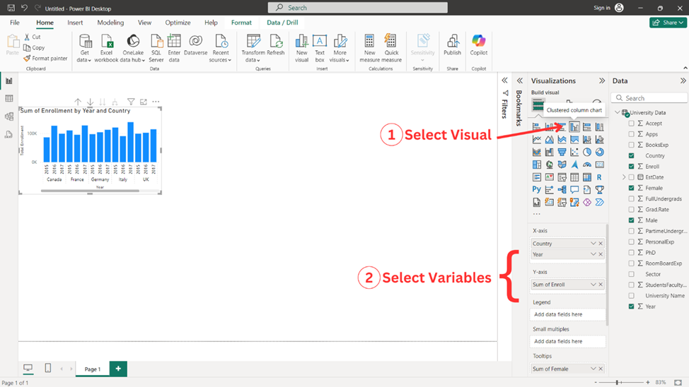
Clustered Column Chart
Clustered Column Chart is a type of bar chart. To make this chart, follow the steps indicated below.
1. Select ‘Clustered Column Chart’ from the ‘Visualizations pane’.
2. Select the variables you wish to add on x-axis and y-axis. Here, the variable ‘Country’ and ‘Year’ are added in x-axis, the variable ‘Enroll’ is added in y-axis, and the variable ‘Female’ and ‘Male’ are added in Tooltips. You can add further details to your chart by adding variables to Legend, Small multiples, and Tooltips as desired.
Customizing Clustered Column Chart
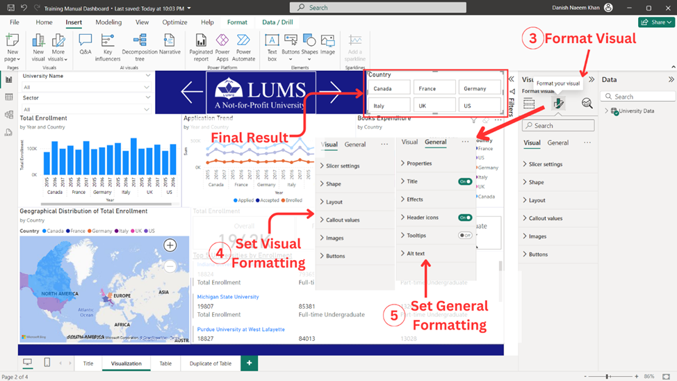
3. Select ‘Format your visual’.
4. In the ‘Visual’ tab, add your desired formatting to the given options. Here, y-axis title and values are adjusted. You can add further details to the available options as desired.
5. In the ‘General’ tab, add your desired formatting to the given options. Here, title is adjusted. You can add further details to the available options as desired.
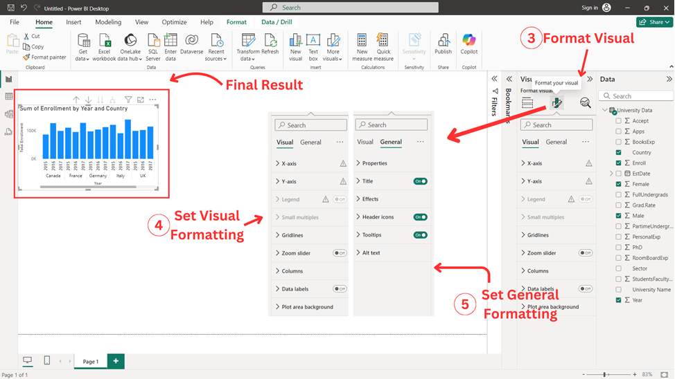
After completing all the above explained steps final result of the visual is achieved as shown in figure above.
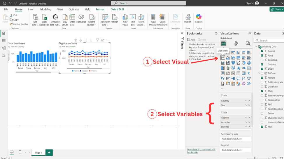
Line Chart
To make this chart, follow the steps indicated below.
Adding Line Chart
1. Select ‘Line Chart’ from the ‘Visualizations pane’.
2. Select the variables you wish to add on x-axis and y-axis. Here, the variable ‘Country’ and ‘Year’ are added in x-axis, the variable ‘Apps’, ‘Accept’, and ‘Enroll’ are added in y-axis, and the variable ‘Female’ and ‘Male’ are added in Tooltips. You can add further details to your chart by adding variables to Secondary y-axis, Legend, Small multiples, and Tooltips as desired.
Customizing Line Chart
3. Select ‘Format your visual’.
4. In the ‘Visual’ tab, add your desired formatting to the given options. Here, y-axis title, values, and legend position are adjusted. You can add further details to the available options as desired.
5. In the ‘General’ tab, add your desired formatting to the given options. Here, title is adjusted. You can add further details to the available options as desired.
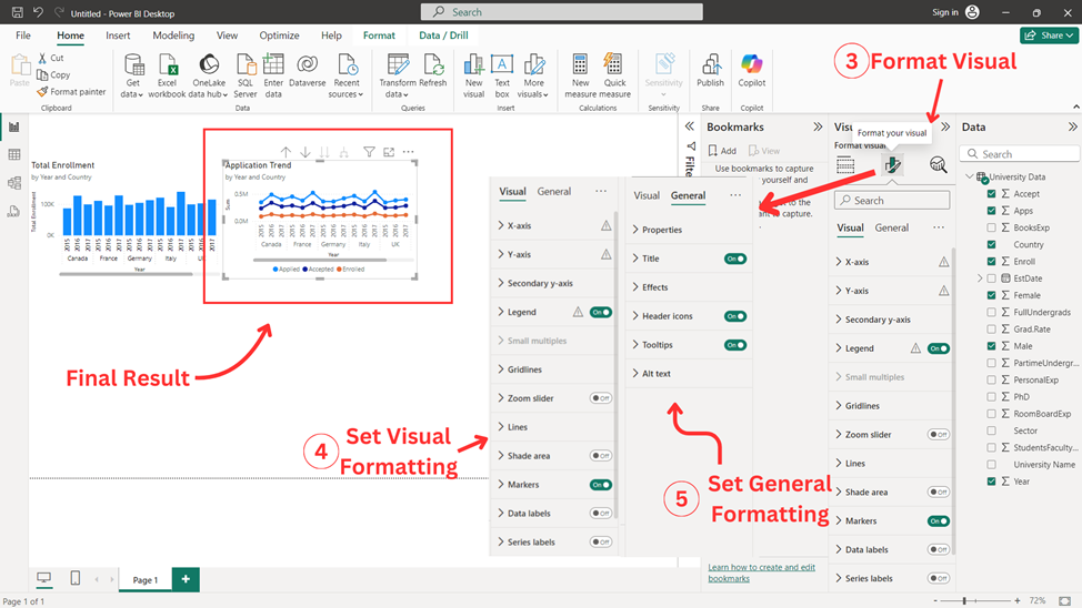
After completing all the above explained steps final result of the visual is achieved as shown above.
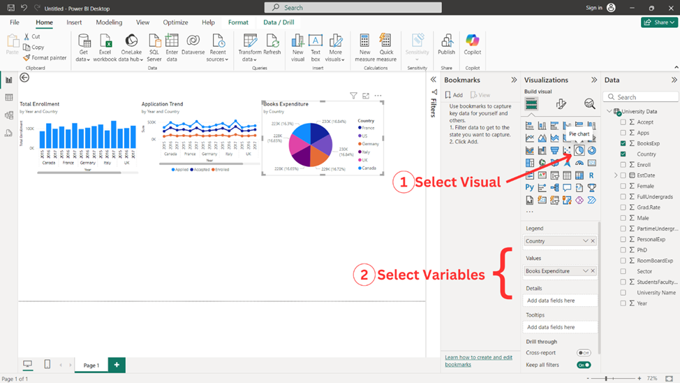
Pie Chart
To make this chart, follow the steps indicated below.
Adding Pie Chart
1. Select ‘Pie Chart’ from the ‘Visualizations pane’.
2. Select the variables you wish to add on x-axis and y-axis. Here, the variable ‘Country’ is added in Legend, and the variable ‘BooksExp’ is added in Values. You can add further details to your chart by adding variables to Details and Tooltips as desired.
Customizing Pie Chart
3. Select ‘Format your visual’.
4. In the ‘Visual’ tab, add your desired formatting to the given options. Here, values in detail labels is adjusted. You can add further details to the available options as desired.
5. In the ‘General’ tab, add your desired formatting to the given options. Here, title is adjusted. You can add further details to the available options as desired.
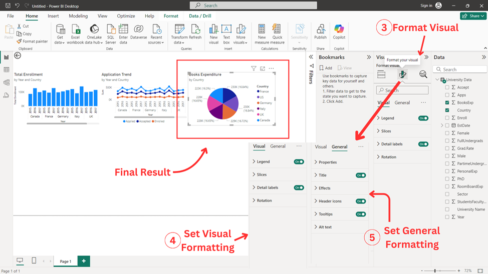
After completing all the above explained steps final result of the visual is achieved as shown above.
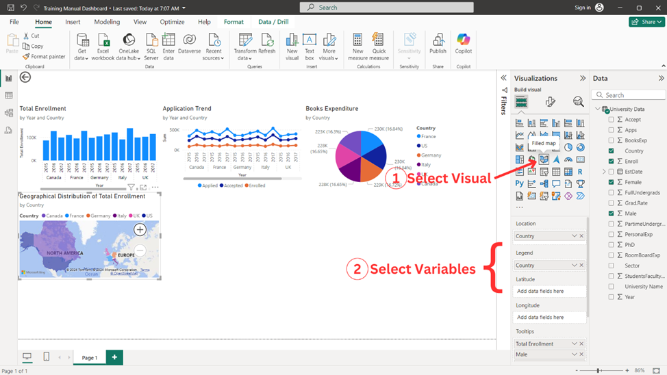
Field Map
To make this chart, follow the steps indicated below.
Adding Field Map
1. Select ‘Field Map’ from the ‘Visualizations pane’.
2. Select the variables you wish to add to Locations and Tooltips. Here, the variable ‘Country’ is added in Legend and Location, and the variable ‘Enroll’, ‘Male’, and ‘Female’ are added in Tooltips. You can add more accurate geological details to your chart by adding longitude and latitude variables to Longitude and Latitude fields respectively.
Customizing Field Map
3. Select ‘Format your visual’.
4. In ‘Visual’ tab, add your desired formatting to the given options. You can add further details to the available options as desired.
5. In ‘General’ tab, add your desired formatting to the given options. Here, title is adjusted. You can add further details to the available options as desired.
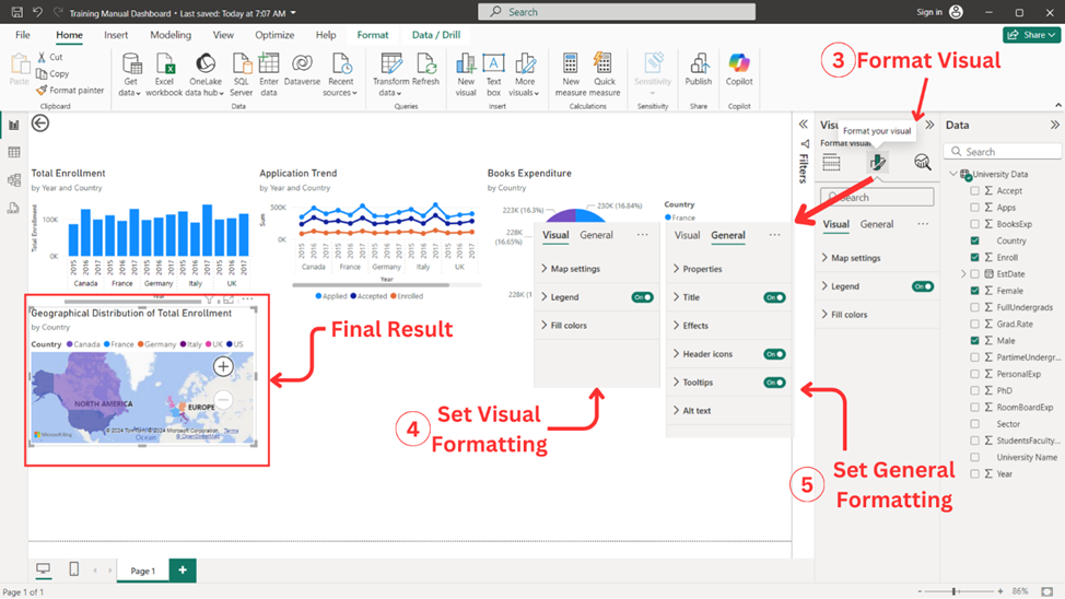
After completing all the above explained steps final result of the visual is achieved as shown above.
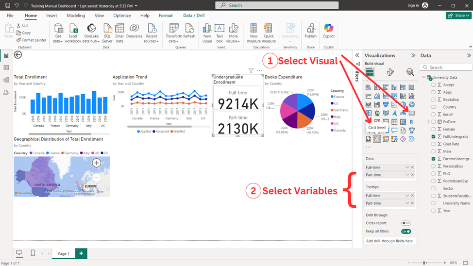
Cards
To make a card, follow the steps indicated below.
Adding Card
1. Select ‘Card’ from the ‘Visualizations pane’. For this example, ‘card(new)’ is selected.
2. Select the variables you wish to add to your card. Here, the variable ‘Enroll’, ‘FullUndergrads’, and ‘PartimeUndergrads’ are added and the same variables are added in Tooltips so that it pops-out the text as the cursor is hovered on the card.
Customizing Card
3. Select ‘Format your visual’.
4. In ‘Visual’ tab, add your desired formatting to the given options. Here, ‘Layout’ and ‘Callout Values’ are adjusted. In the Layout, ‘Arrangement’, ‘Style’, ‘Max cards shown’, and ‘Space between cards’ are crucial to adjust based on your requirements. You can add further details to the available options as desired.
5. In ‘General’ tab, add your desired formatting to the given options. Here, title is adjusted and tooltip is activated manually. You can add further details to the available options as desired.
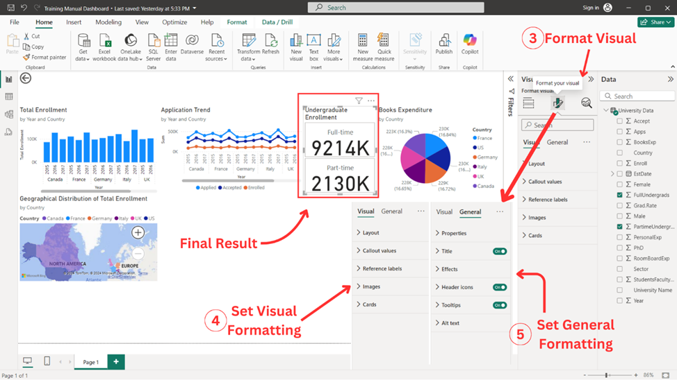
After completing all the above explained steps final result of the visual is achieved as shown above.
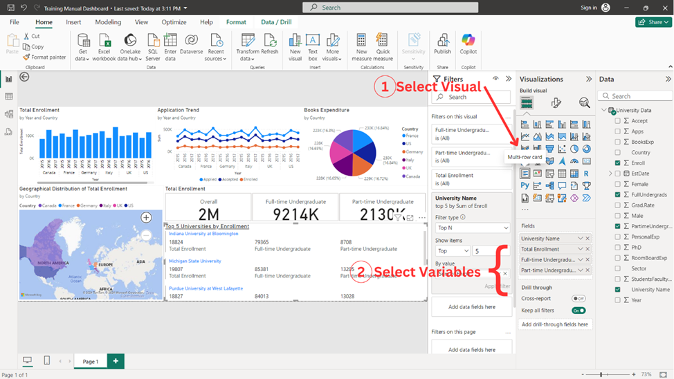
Multi Row Cards
To make a card, follow the steps indicated below.
Adding Multi Row Card
1. Select ‘Multi Row Card’ from the ‘Visualizations pane’.
2. Select the variables you wish to add to your Multi Row card. Here, the variable ‘University Name’, ‘Enroll’, ‘FullUndergrads’, and ‘PartimeUndergrads’ are added and desired filter of ‘Top N’ is applied.
Customizing Multi Row Card
3. Select ‘Format your visual’.
4. In ‘Visual’ tab, add your desired formatting to the given options. You can add further details to the available options as desired.
5. In ‘General’ tab, add your desired formatting to the given options. Here, title is adjusted. You can add further details to the available options as desired

After completing all the above explained steps final result of the visual is achieved as shown above.
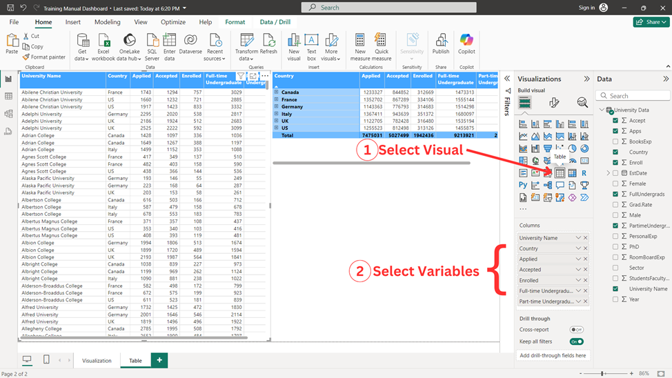
Tables
To make a table, follow the steps indicated below.
Adding Table
1. Select ‘Table’ from the ‘Visualizations pane’.
2. Select the variables you wish to add to your table. Here, the variable ‘University Name’, ‘Country’, ‘Apps’, ‘Accept’, ‘Enroll’, ‘FullUndergrads’, and ‘PartimeUndergrads’ are added.
Customizing Table
3. Select ‘Format your visual’.
4. In ‘Visual’ tab, add your desired formatting to the given options. Here, ‘Column header’ is adjusted. You can add further details to the available options as desired.
5. In ‘General’ tab, add your desired formatting to the given options.
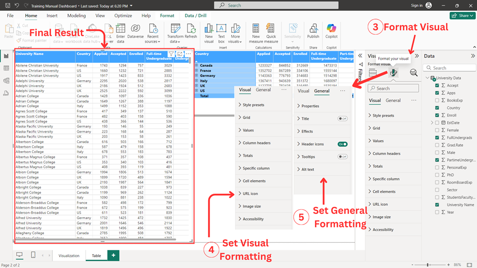
After completing all the above explained steps final result of the visual is achieved as shown above.
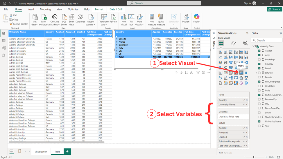
Matrix
Matrix is a sort of table which is used to report stats in a tabular form. To make a matrix, follow the steps indicated below.
Adding Matrix
1. Select ‘Matrix’ from the ‘Visualizations pane’.
2. Select the variables you wish to add to your matrix. Here, the variable ‘University Name’, ‘Country’ are added in fields and ‘Apps’, ‘Accept’, ‘Enroll’, ‘FullUndergrads’, and ‘PartimeUndergrads’ are added in Values.
Customizing Matrix
3. Select ‘Format your visual’.
4. In ‘Visual’ tab, add your desired formatting to the given options. Here, ‘Column header’ and ‘Row header’ colors and font are adjusted. You can add further details to the available options as desired.
5. In ‘General’ tab, add your desired formatting to the given options.
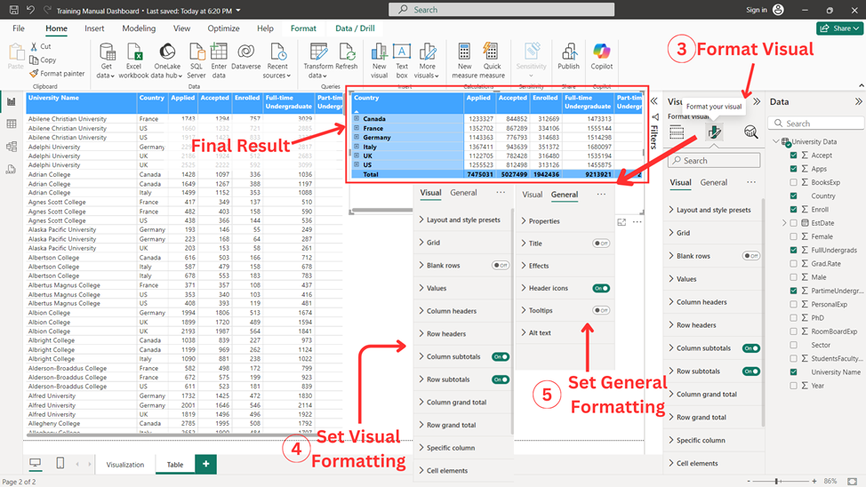
After completing all the above explained steps final result of the visual is achieved as shown above.
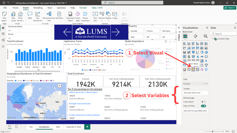
Slicers
Slicer is a sort of filter which can be used to filter data for the whole page. To make a slicer, follow the steps indicated below.
Adding Slicer
1. Select ‘Slicer’ from the ‘Visualizations pane’. For this example, ‘slicer(new)’ is selected.
2. Select the categorical variable(s) you wish to add to your slicer. Here, the variable ‘Country’ is added in fields.
Customizing Slicer
3. Select ‘Format your visual’.
4. In ‘Visual’ tab, add your desired formatting to the given options. Here, ‘Slicer settings’ is adjusted. You can add further details to the available options as desired.
5. In ‘General’ tab, add your desired formatting to the given options. Here, ‘Title’ is added. You can add further details to the available options as desired.
After completing all the above explained steps final result of the visual is achieved as shown above.
Q&A
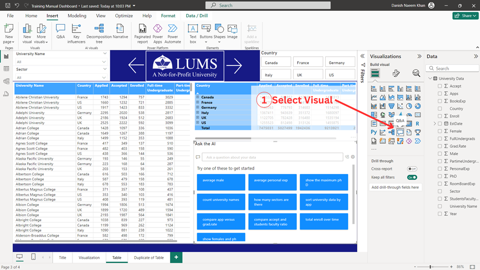
Q&A is an AI tool which can be used to generate visualizations using a text prompt. To make a Q&A, follow the steps indicated below.
Adding Q&A
1. Select ‘Q&A’ from the ‘Visualizations pane’.
Customizing Q&A
2. Select ‘Format your visual’.
3. In the ‘Visual’ tab, add your desired formatting to the given options.
4. In the ‘General’ tab, add your desired formatting to the given options. Here, ‘Title’ is added. You can add further details to the available options as desired.
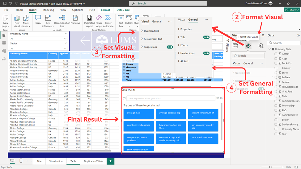
After completing all the above explained steps final result of the visual is achieved as shown above.
Navigating Pages
Along with adding visuals, it is also important to add navigator, buttons, and bookmarks to add seamless navigation to your Power BI dashboard.
Page Navigator
In order to add page navigator, follow the steps indicated in the figure below.
1. Go to ‘Insert’.
2. Select ‘Buttons’.
3. Select ‘Navigator’.
4. Select ‘Page Navigator’.
You can also customize the shape, size, and coloring of the navigator in the format tab.
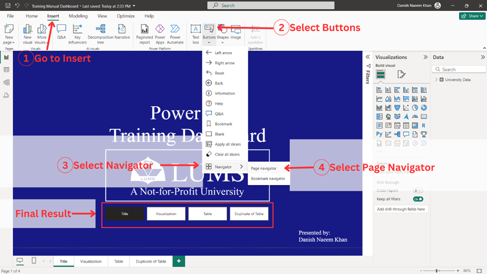
After completing all the above explained steps final result achieved is shown above.
Buttons
To navigate pages, most commonly used tool is called buttons. In order to add buttons, follow the steps indicated below.
1. Go to ‘Insert’.
2. Select ‘Buttons’.
3. Select the type of button you wish to add.
4. Select the action of the button and the desired ‘Destination’ page of the button.
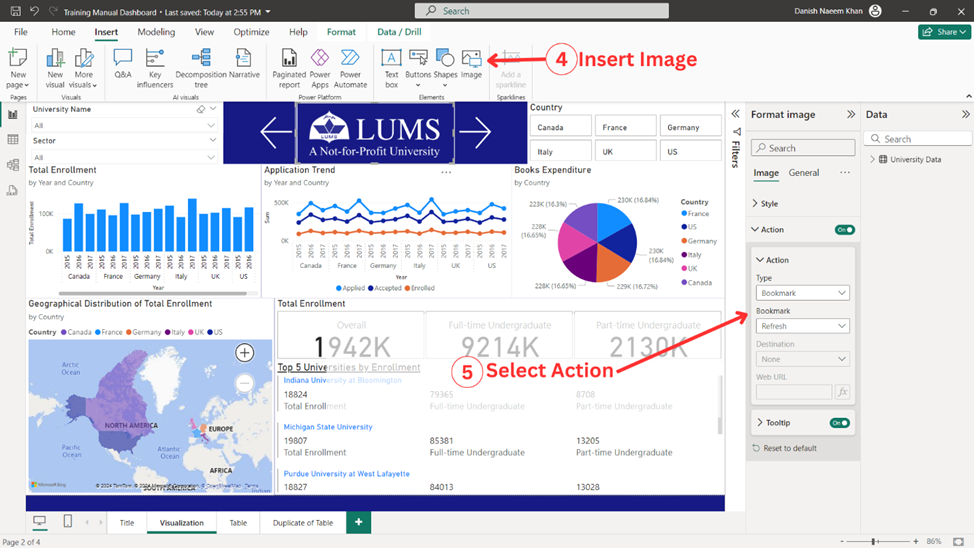
You can also customize the shape, size, and coloring of the buttons in the format tab. Moreover, ‘images’ can also be used as buttons by selecting desired action to an image.
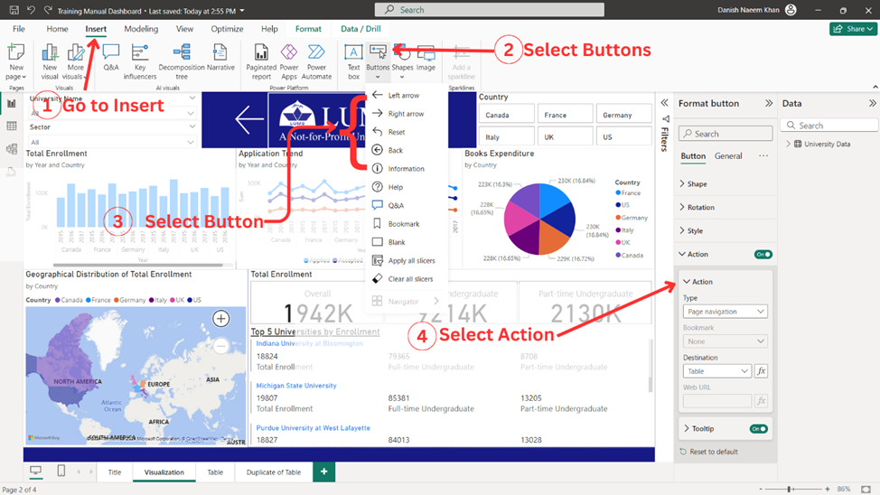
After completing all the above explained steps final result achieved is shown above.
Bookmarks
By adding bookmarks one can reset a page to the specific point in time when the bookmark was added to the page. In order to add bookmarks, follow the steps indicated below.
1. Go to ‘Insert’.
2. Select ‘Buttons’.
3. Select ‘Bookmarks’.
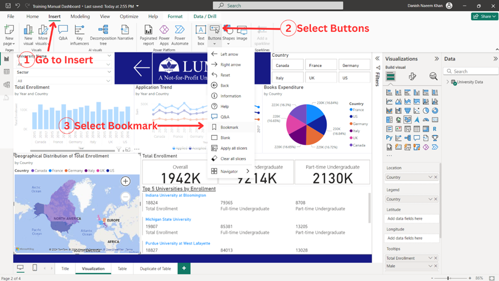
4. Select an image/button you wish to add bookmark to. For this example, bookmark is added to an image.
5. Select ‘Bookmark’ in ‘Action type’ and select the desired bookmark.
Well done on reaching this stage in your Power BI journey! You’ve now learned how to add visuals, tables, buttons, navigators, and slicers to your reports, enhancing both the interactivity and depth of your dashboards. In the next blog, we’ll build on this foundation by diving into how to perform calculations in Power BI, adding another layer of analysis to your reports. Calculations will empower you to derive deeper insights and make data-driven decisions. Keep up the great work, and get ready to take your Power BI skills to the next level!

Danish is a Program Specialist in OPE.