
Which graph do I choose? A beginner’s guide to visualizing institutional data
One of the biggest challenges in the work of a data analyst is how to present their work. You may have written sophisticated code spanning hundreds of lines to draw insights from large and complex datasets but if those insights are not presented right, your work loses impact!
So, choosing the best method to visualize and present results is an all-important task to summarize all that hard work. In the first blog of this series, I will highlight some simple ways to present data that we often use as institutional researchers using static (i.e., not interactive) graphs.
Before we get specific, here is a simple yet effective advice that I have learned during my five years as an institutional researcher: start simple! You do not have to think about complicated ways to present data. Begin your data visualization process with the simplest graph that is applicable. Complex layers inevitably get added to analysis. So, make your lives easy and start simple!
That said, let’s delve deeper…
The bar chart is often your best friend…
A lot of times the results you want to present can be communicated effectively with a bar chart. We know that the bar chart is best used to compare the counts or proportions of different groups – in other words, breakdowns. So, when you want to compare a metric across different discrete groups, think bar graph!
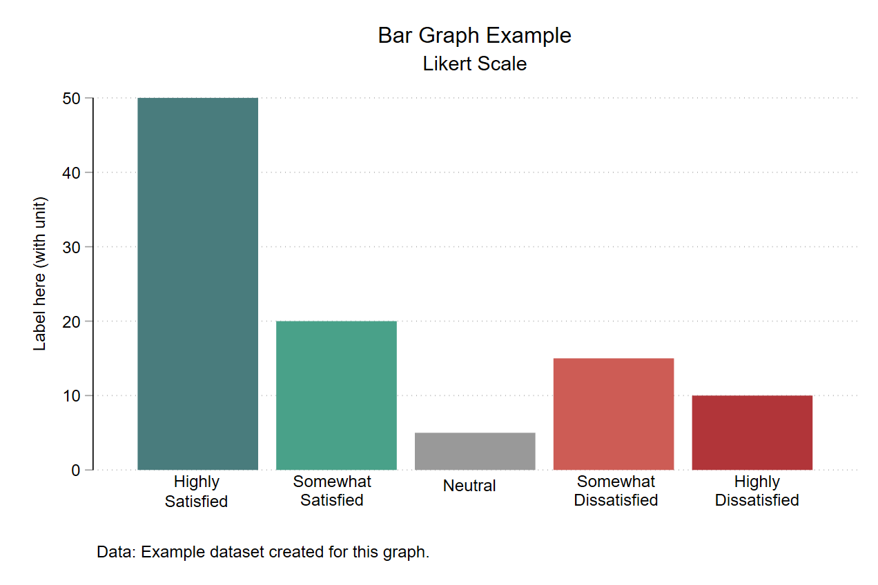
It just so happens that a lot of the data that we work with is of this nature. For example, survey results where the goal was to gauge faculty satisfaction with the academic support provided to them. The Likert scale options could be presented with a simple bar graph with varying colors of bars (see below).
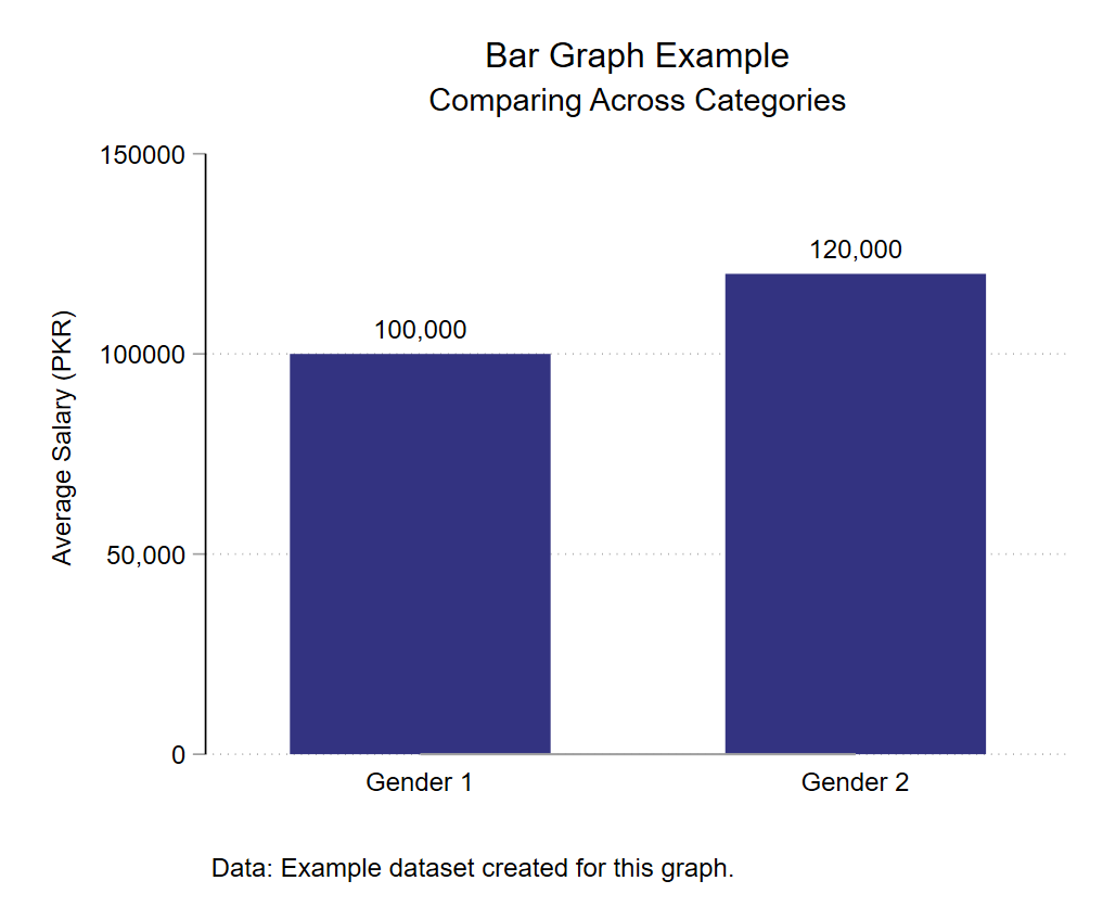
Or say you want to represent the average salaries of university administrative staff by their gender. Again, a bar graph is there to help!
Sometimes, when you want to present categorical information over two time periods, a bar graph should be your choice. For example, a university has three schools, and you need to present total enrollment in each school for two years. You could use a bar graph as shown below for this purpose.
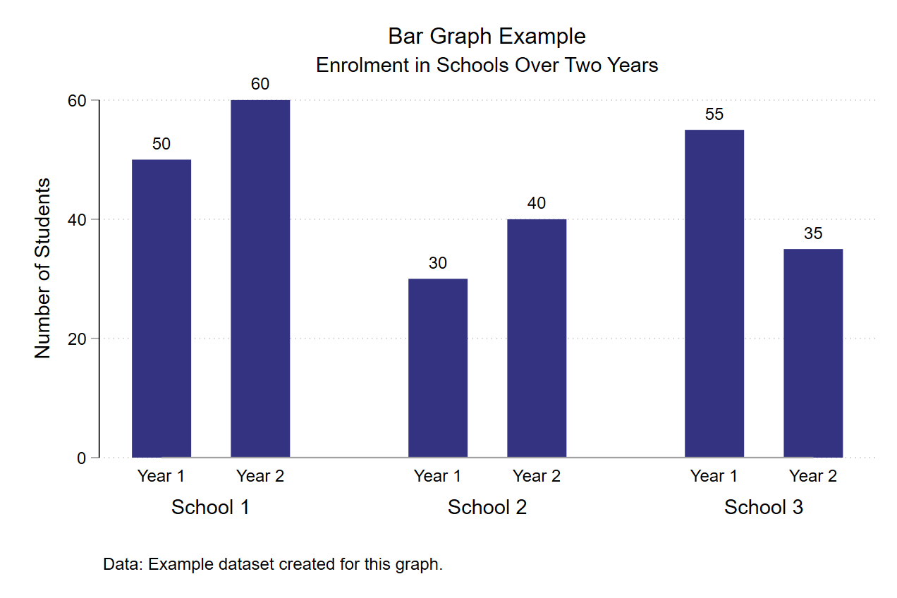
Notice how this requires presenting information over time but as there are only two years and we need to show school level breakdown, bar graph is the go-to option, not a line graph showing time trend.
When to choose trend lines over bar charts…
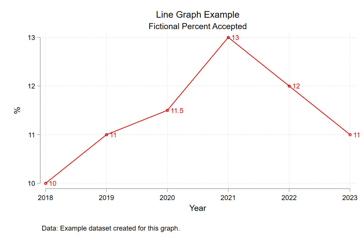
The preceding advice might have you thinking when is it better to choose trend lines over bar graphs? The answer is simple: when you want to present some type of trend (usually over time).
So, when you have data over time (for more than two periods at least), and the task requires that you present the trend in data – for example, the university’s acceptance rate – go for the trend line!
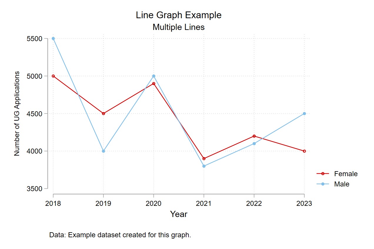
You can also compare trends using trend lines! For example, trend in the number of female undergraduate (UG) applications vs male UG applications to the university.
What if there are too many trend lines?
Let’s say you want to compare the trend of UG applications over six years coming from students of different high schools – where each line represents a unique high school. As you can imagine, there will be many lines! In such cases, it makes sense to divide the information over graphs.
One way to do that is to sort high schools in descending number of applications and present the top five schools with most applications on one graph and so on. University decision-makers may only be interested in the top ten application feeder schools so two graphs might suffice.
Another solution could be to create an interactive graph but we won’t discuss those in this blog post.
Before parting here, I want to add some basic guidelines to always remember when making graphs:
General considerations regarding graphs:
Title
The graph title should be precise, and not too lengthy. It needs to effectively summarize what the graph is about.
Axis labels
Axis labels should clarify what is presented on each axis and in what units. Sometimes, the graph title explains what is present on one of the axes. In this case, it becomes redundant to add an axis label as that just duplicates information!
Readability
Do ensure that your graph is readable. To show everything, one can often fall into the trap of presenting a graph that makes no sense! So, make sure to avoid clutter and focus on showing what is important!
What is important?
Last piece of advice before I bid you adieu (for now), and this should probably have come in the beginning but oh well: remember the audience. Show what you expect the audience wants to learn about. If the university administration is interested in figuring out whether a fee increase will reduce the number of applications and you end up showing, in great detail, the breakdown of the trend in applications, important as it may be, and extensive work it may have required from you; it will not go down well with the audience as you failed to answer their question!
So, do what is required. Not more, not less!

I teach and work in IR at LUMS. Would love to hear readers' thoughts on this piece. Feel free to write to me on rabia_khan@lums.edu.pk.